
{{ svc.title }}
- {{ line }}
Branding • Web Design • Graphic Design
Branding, websites, and graphic design that help small businesses look established, stand out, and grow.
You've already put the work into building your business. We help make sure your brand reflects it.
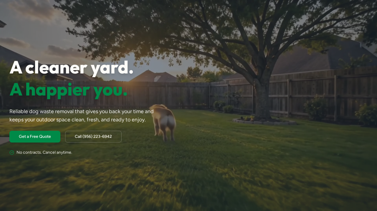
Website, marketing, and apparel designed to turn a new local service into a recognizable brand.
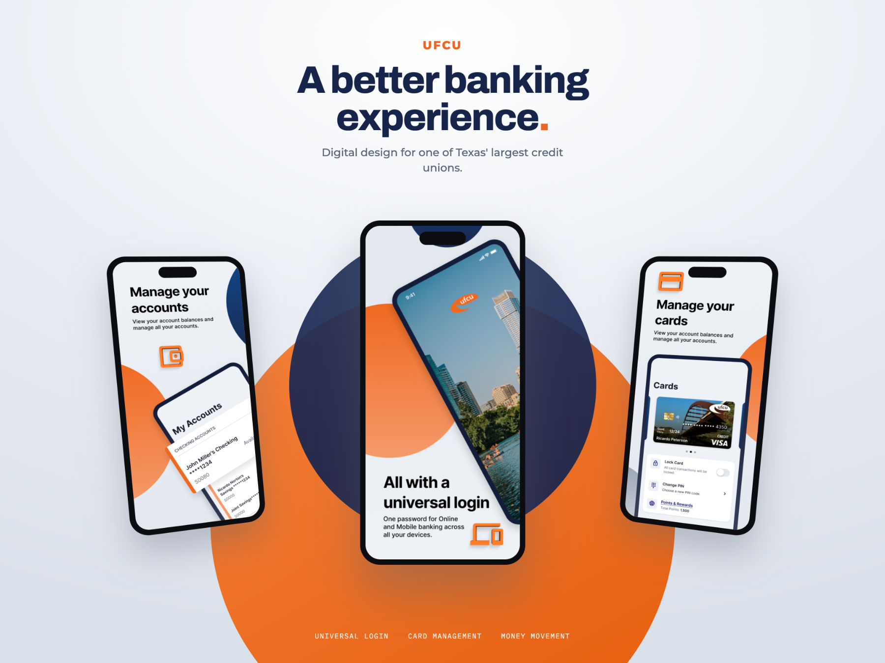
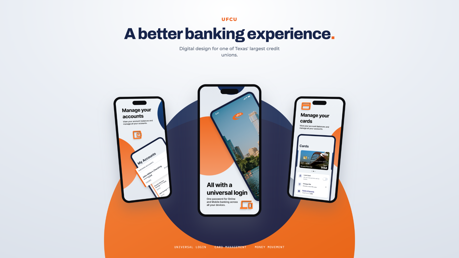
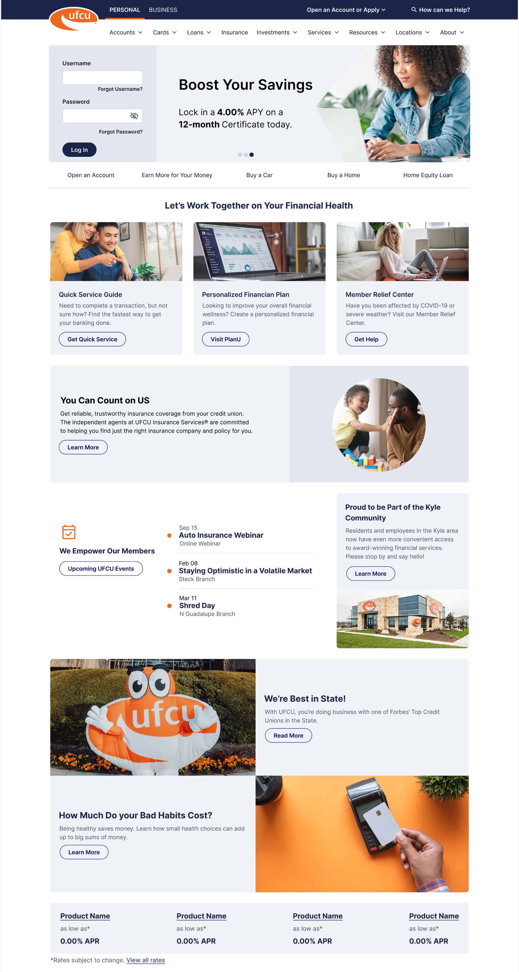
Digital and marketing design for one of Texas’ largest credit unions.
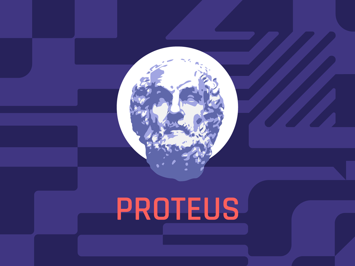
Interface and visual design for an emerging technology platform.
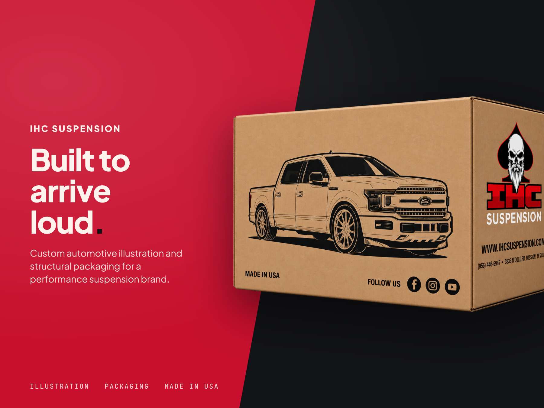
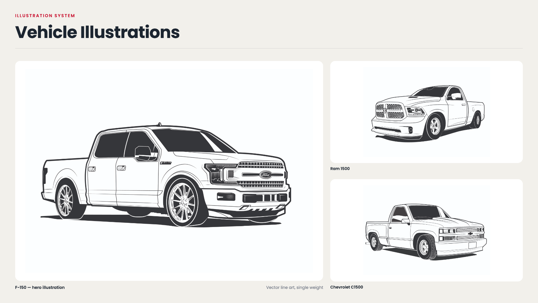
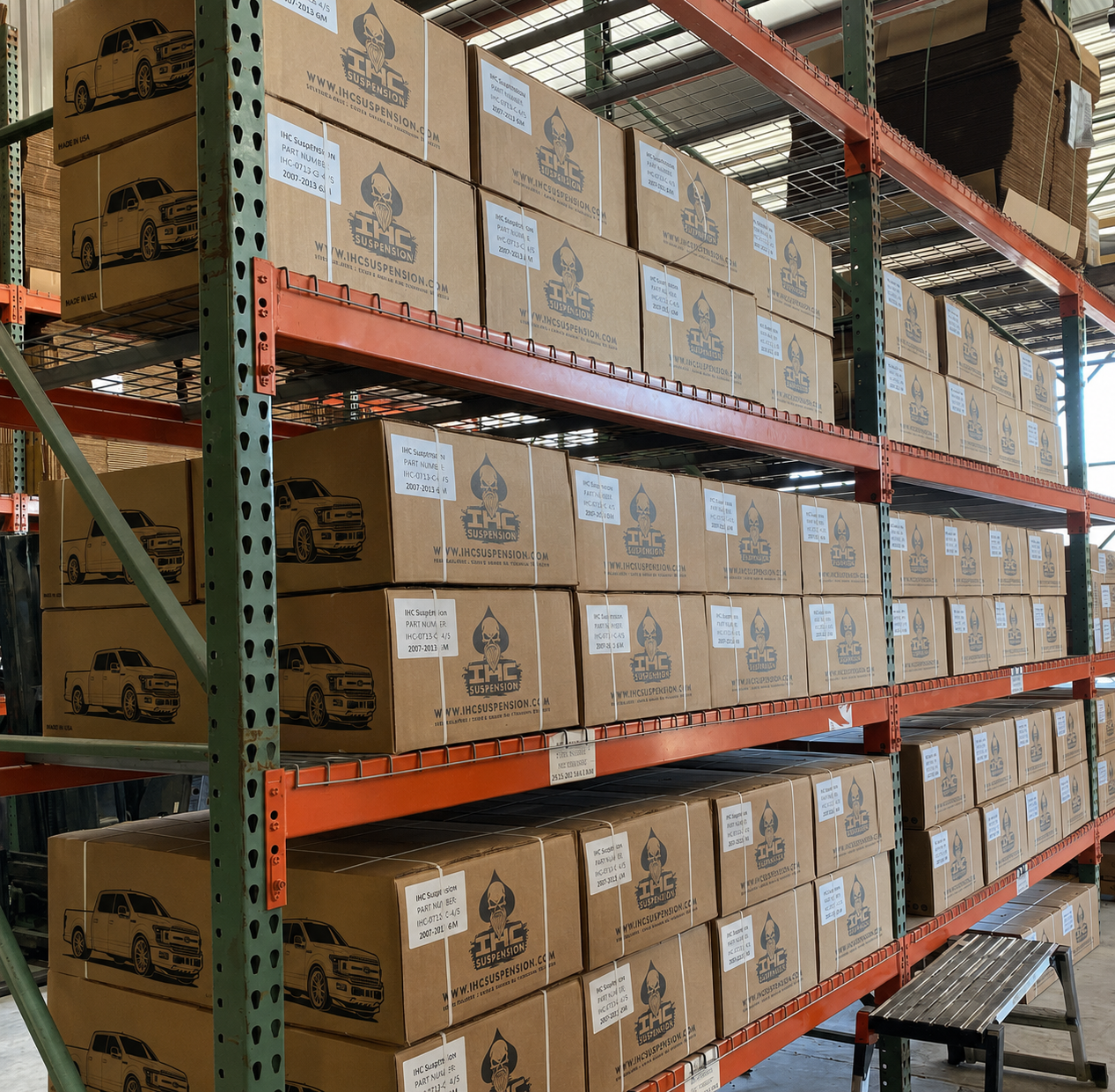
Custom illustration and production packaging for a local automotive suspension brand.
Customers make decisions quickly. A professional brand and website can make the difference between being overlooked and being trusted.
It's how your business introduces itself before you ever speak to a customer.
Build confidence from the first impression.
Create an identity customers recognize.
Give customers a clear path to take the next step.
{{ step.copy }}
Brand Gravity gives small businesses professional design without the complexity, overhead, or runaround of a traditional agency.
{{ faq.a }}
Have a project in mind?
Tell me what you're working on and I'll help you figure out the best way to bring it to life.
Services
Three ways to work together. Pick the one that fits, or ask and we'll point you in the right direction.
{{ svc.blurb }}
{{ detail.eyebrow }}
{{ detail.intro }}
{{ step.copy }}
Work
Branding, websites and graphics for businesses of a very human size.
{{ p.industry }}
{{ p.services }}
Independent design. Agency-level thinking.
Brand Gravity is an independent studio. You work directly with the person doing the design, which keeps things clear and the work consistent.
Behind it is 10+ years of professional design experience across product and UX, visual design, branding, and real-world work with small businesses. In practice, that means a professional process, straight answers, and design made for how your business actually runs.
Contact
Tell me what you're working on and I'll help you figure out the best way to bring it to life.
Prefer email? hello@brandgravitydesign.com
We'll be in touch within one business day. You can also reach us at hello@brandgravitydesign.com.
{{ proj.category }}
{{ proj.statement }}
Overview
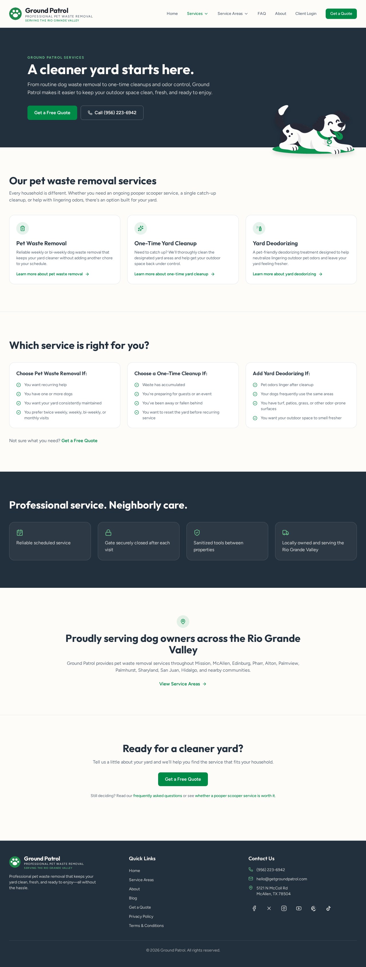
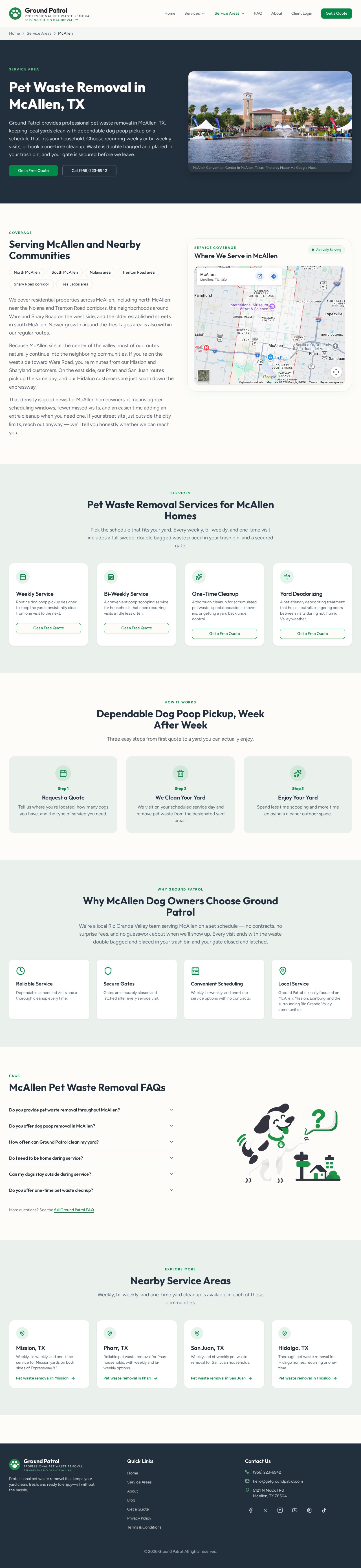
Ground Patrol is a pet waste removal service working with homeowners across its local area. The business was starting from scratch and needed everything a customer would see before deciding to book.
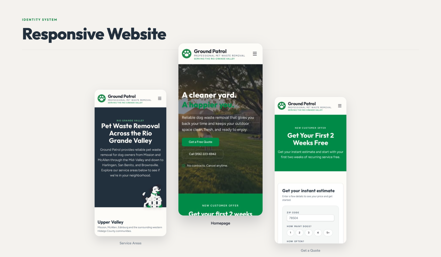
The work covered the visual identity, the website, marketing graphics and apparel — one system applied consistently across digital and physical touchpoints.
Building the Brand
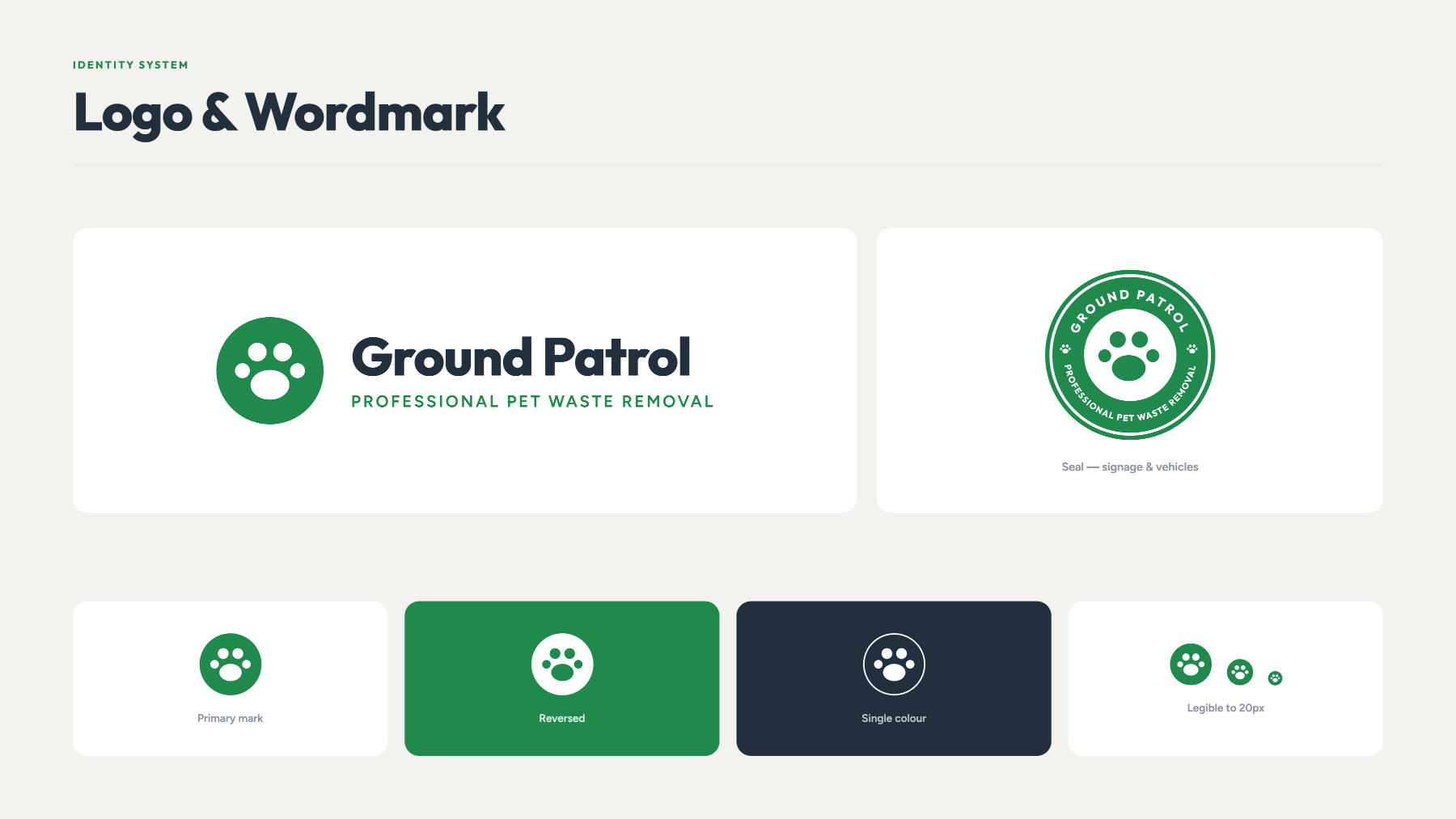
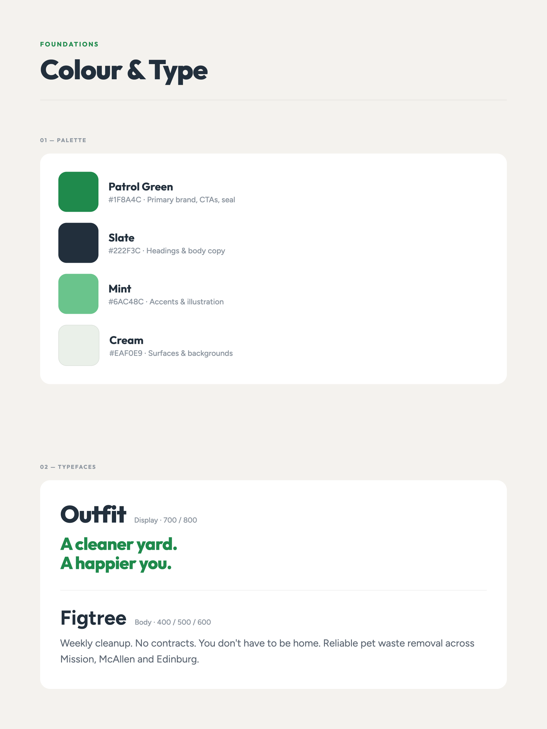
The identity leads with a straightforward wordmark, a confident color pairing and type that stays readable at yard-sign scale.
Website
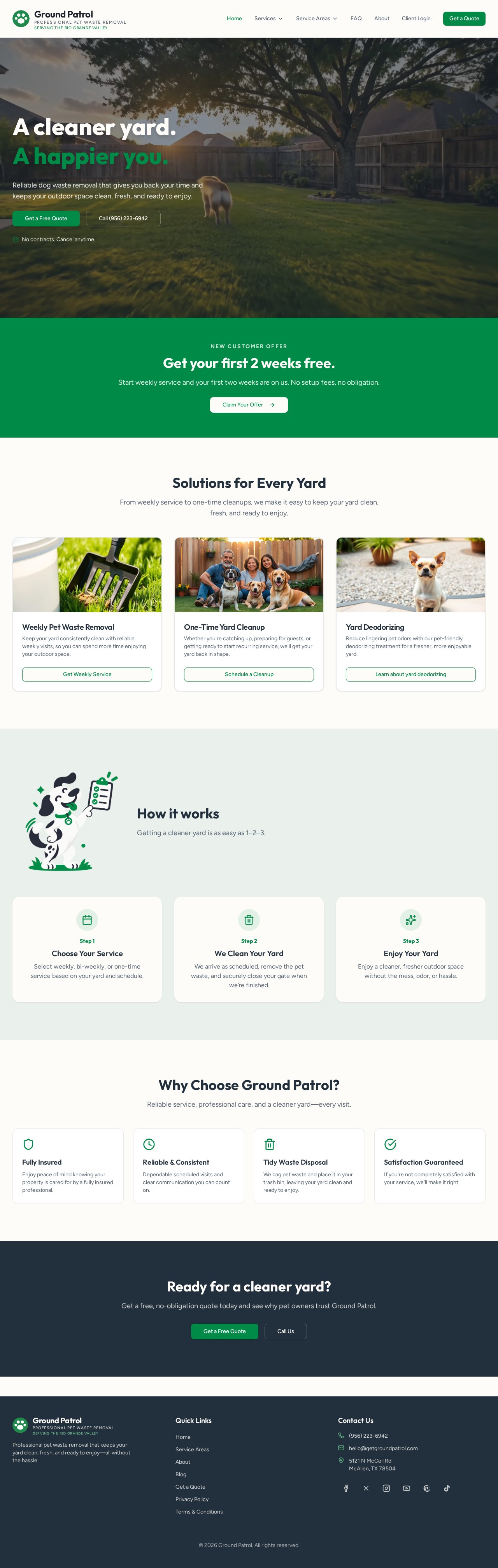
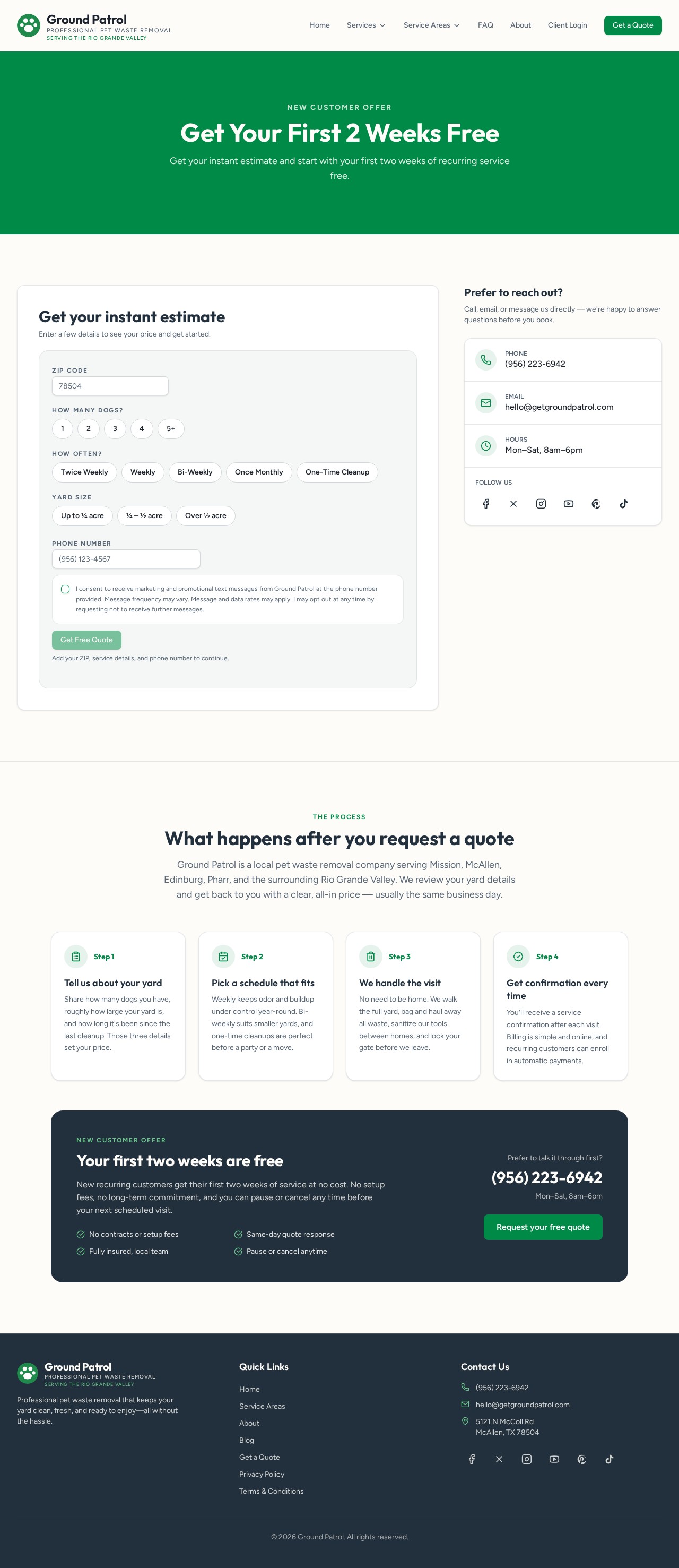
The site puts service, area and price where customers look first, then keeps the path to a quote short. Every page holds the same hierarchy so the brand reads as one business.
Marketing
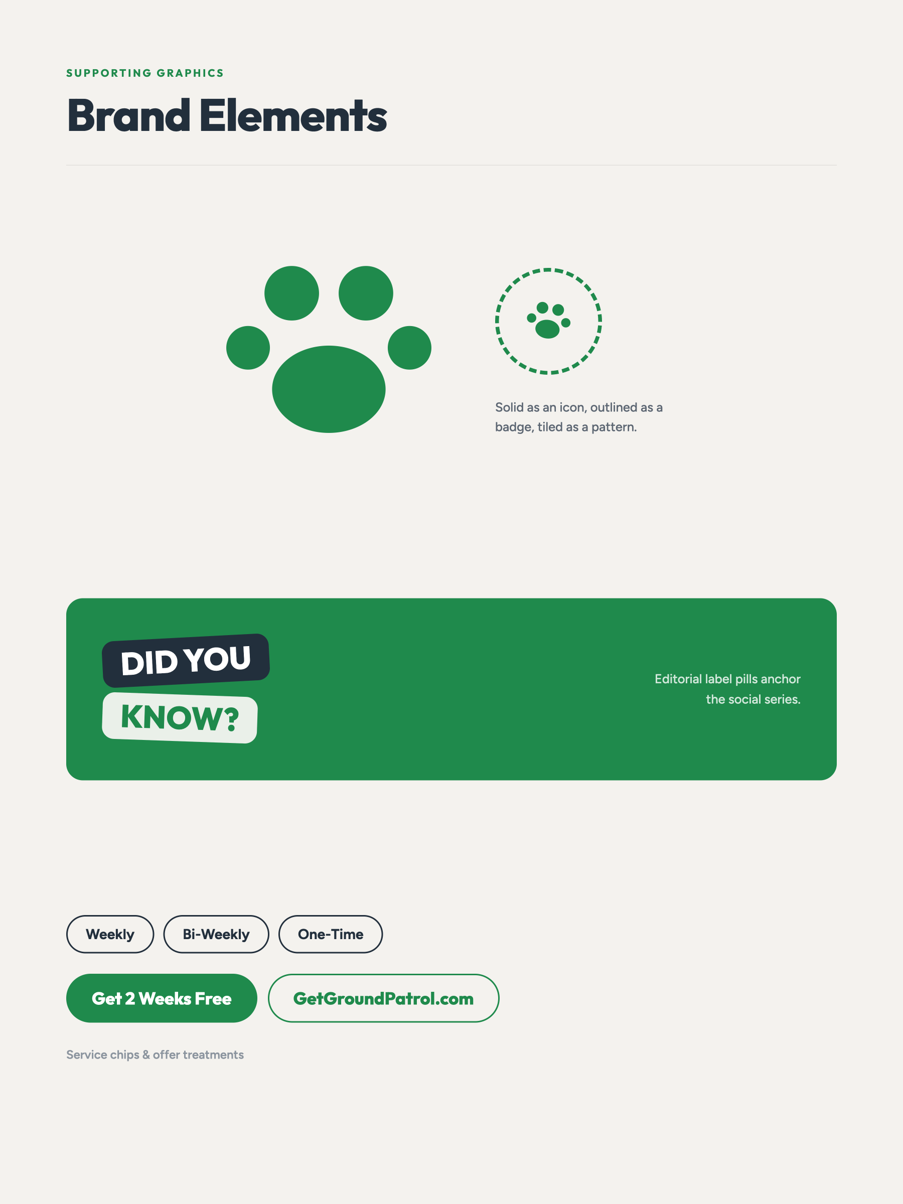
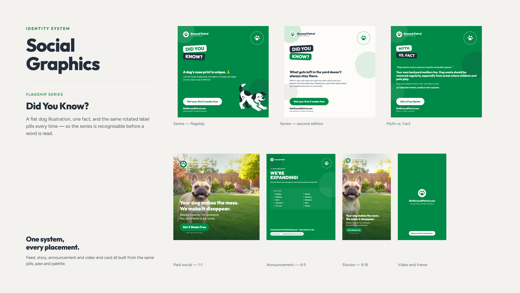
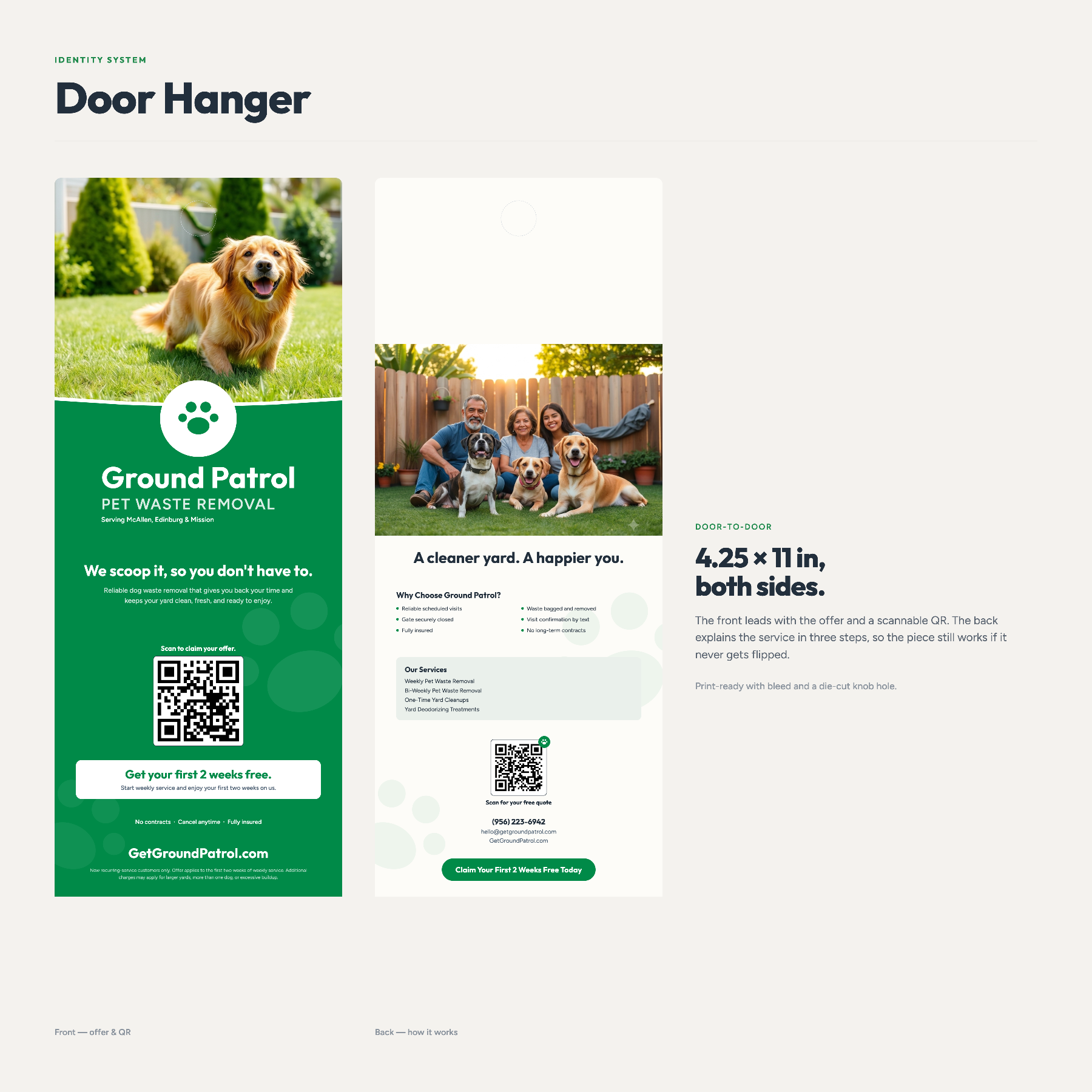
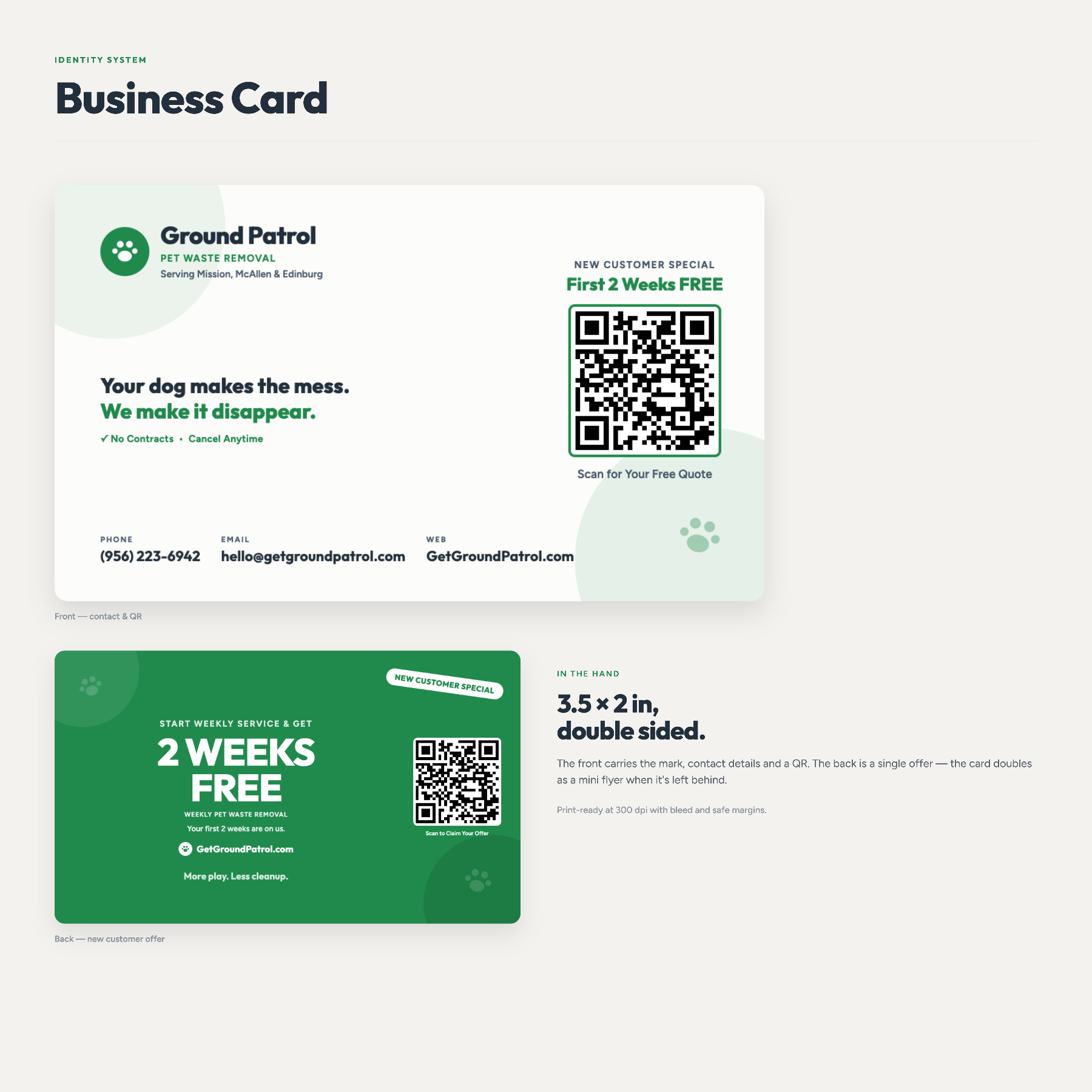
Social and promotional pieces reuse the same color, type and framing, so each impression builds on the last rather than starting over.
Apparel & Applications
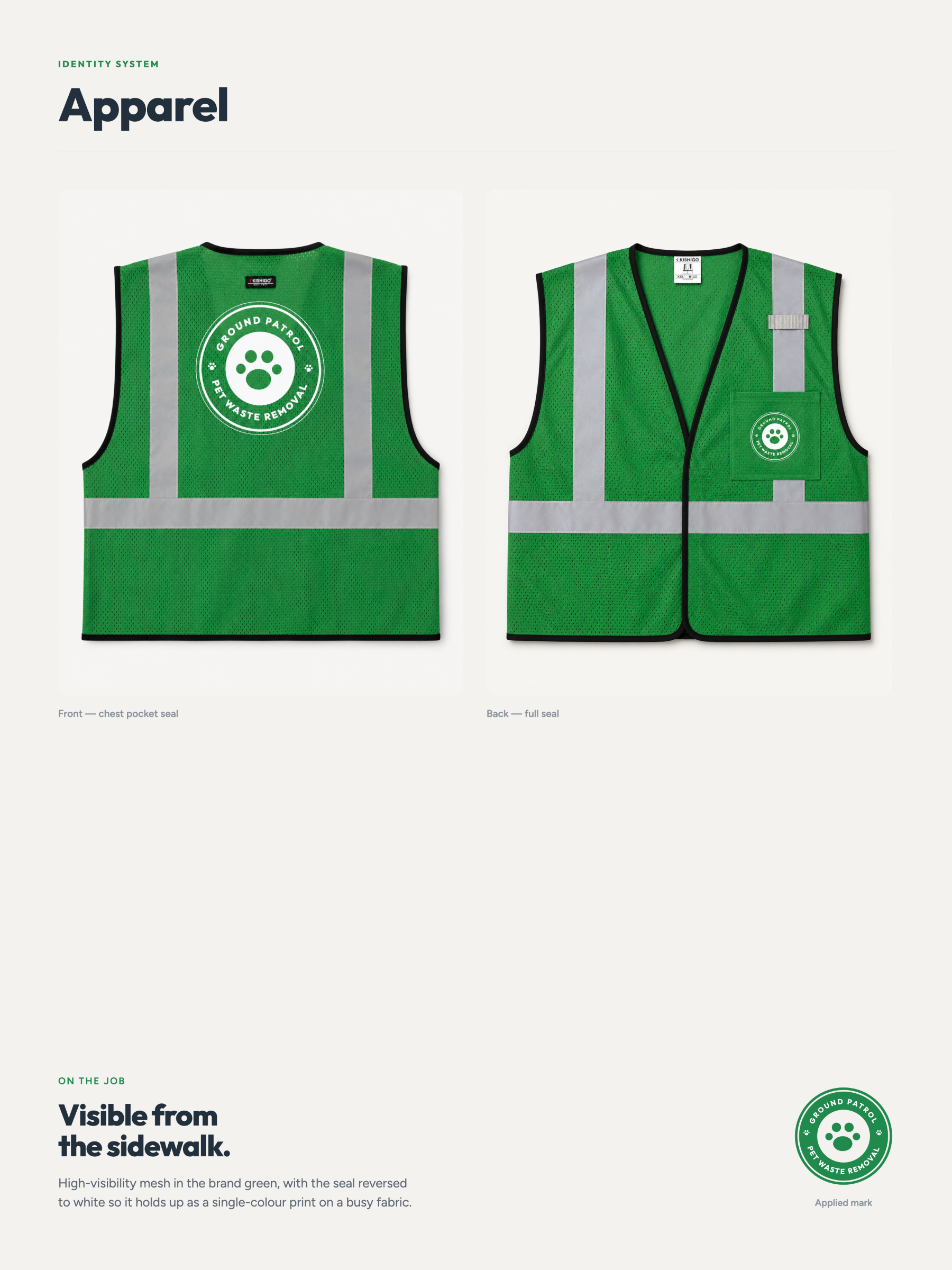
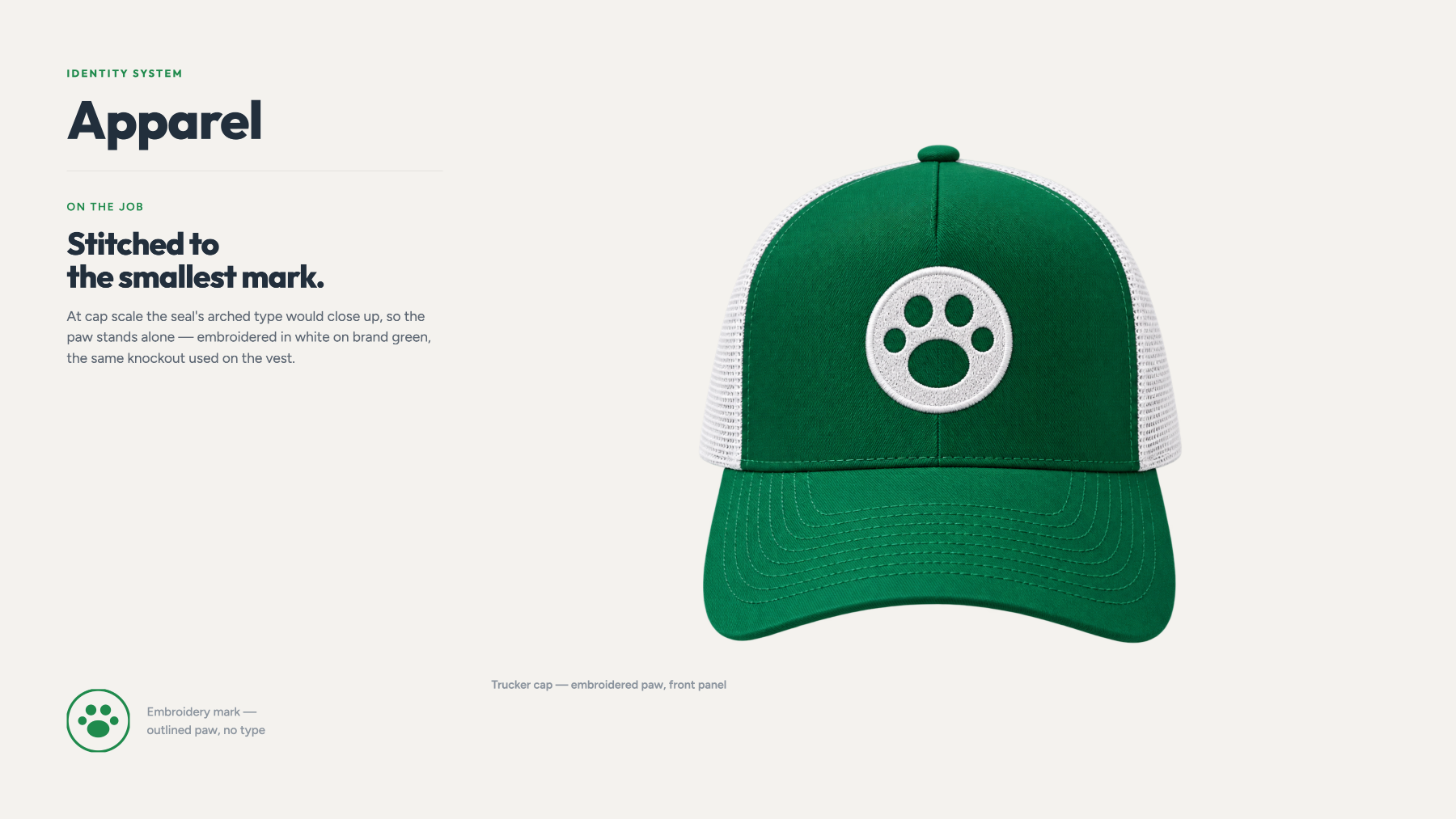
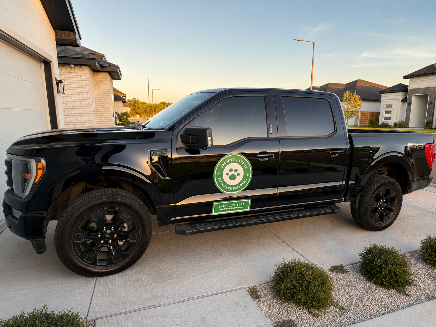
Shirts, signage and vehicle applications carry a simplified version of the mark, sized to stay legible at a distance.
Overview
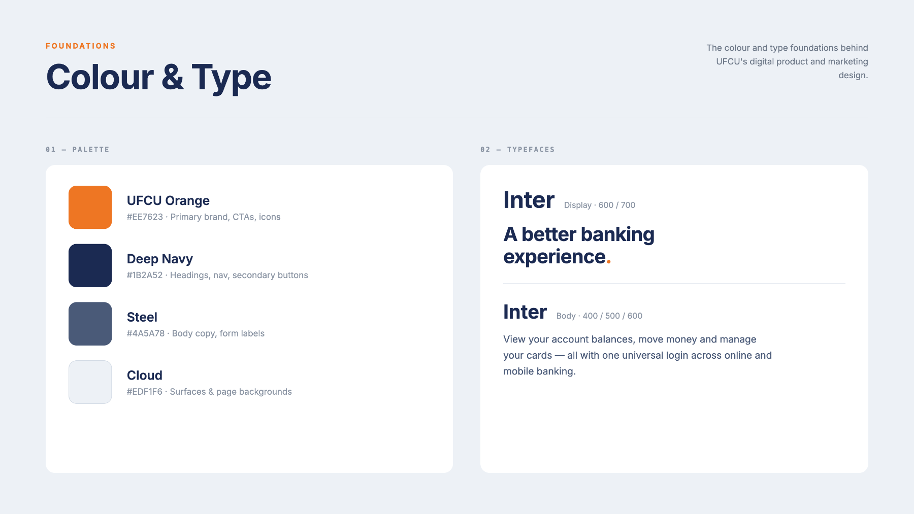
UFCU serves a large membership across Texas. The work spanned digital product design and marketing design, produced inside an established brand and accessibility standard.
The goal throughout was clarity: financial products explained plainly, in screens and graphics that hold together as one experience.
Visual Communication
Marketing graphics and interface work were designed against the same rules, so a campaign and the product it points to feel like one organisation.
Digital Design
Layouts were built to hold long product names, disclosures and rate detail without losing hierarchy.
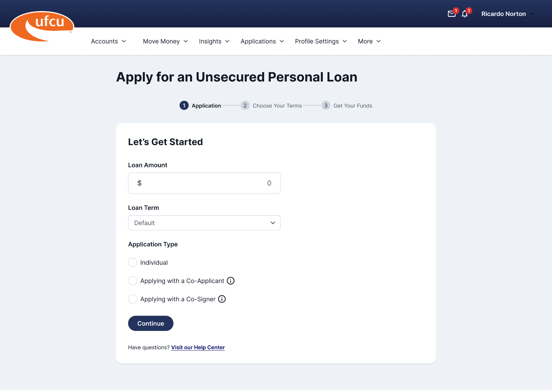
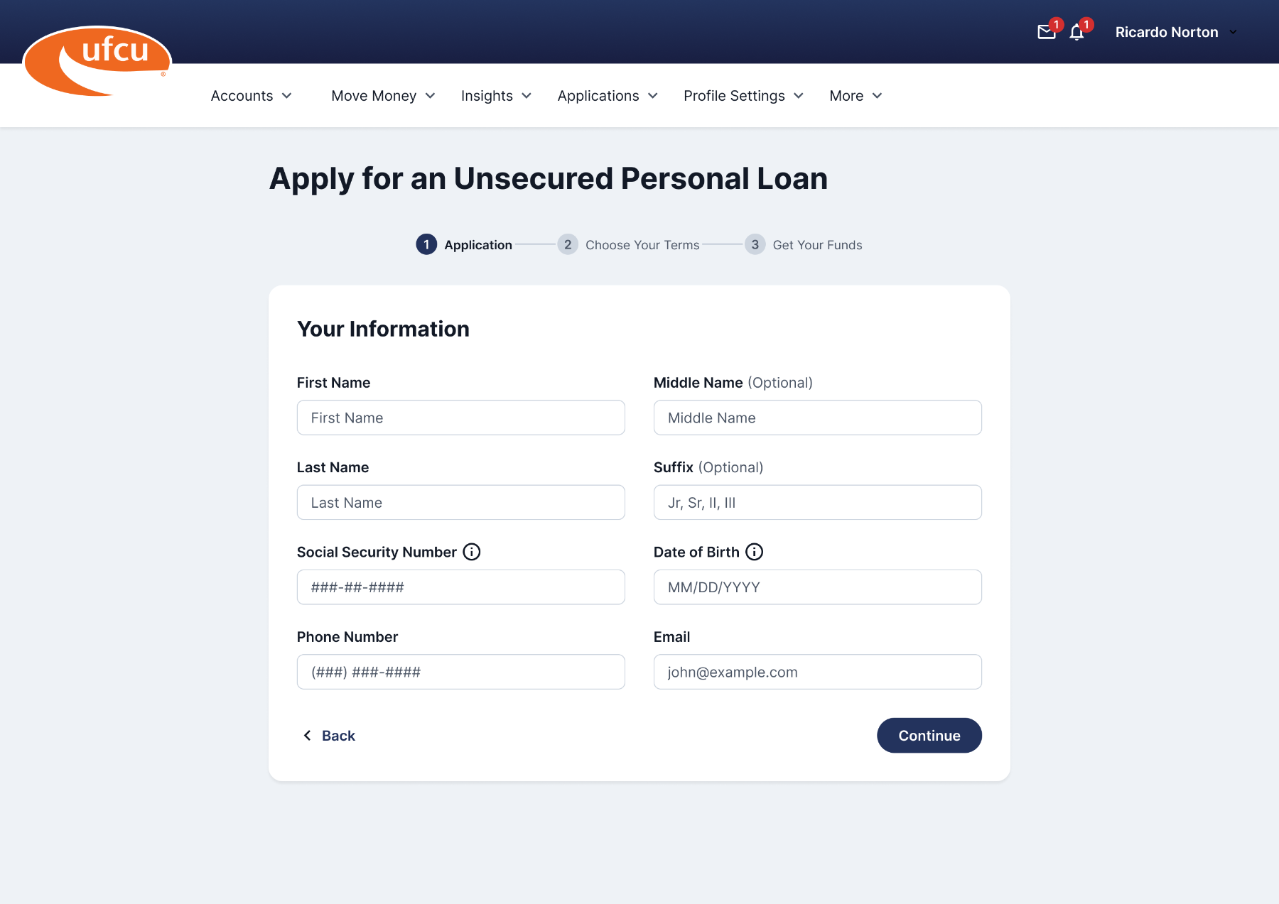
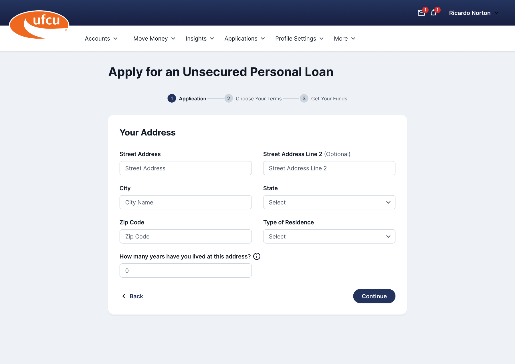
Unsecured Loan
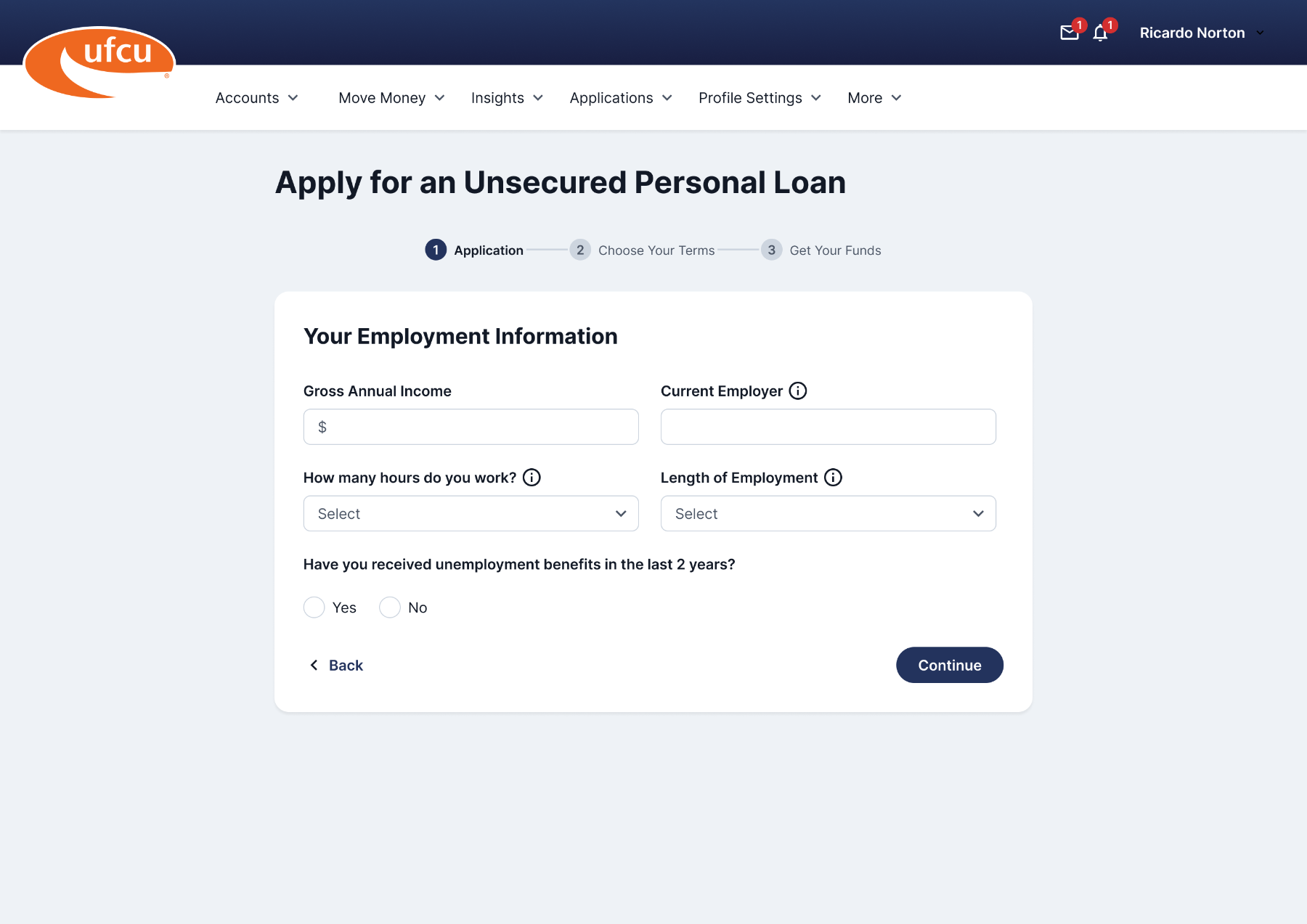
The unsecured loan experience needed to make terms understandable before a member commits — plain language, visible rates, and a short path through the application.
App Store
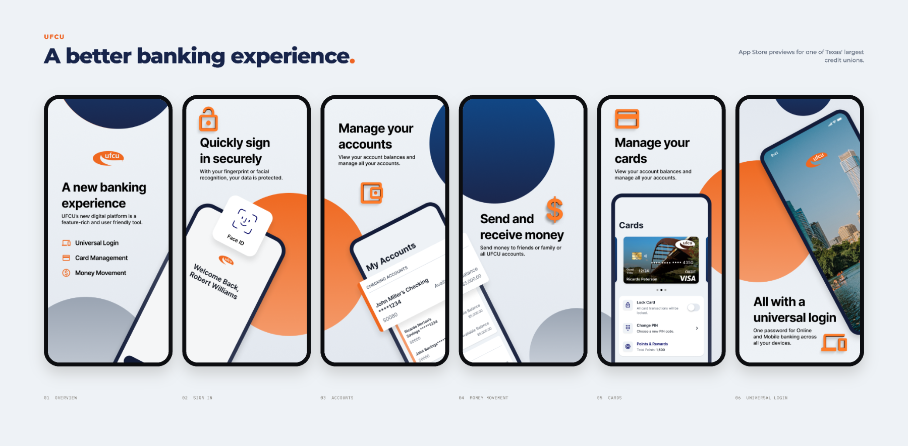
Each panel carries one message, set in the brand’s type and color so the set reads as a sequence rather than separate screenshots.
iOS Widgets
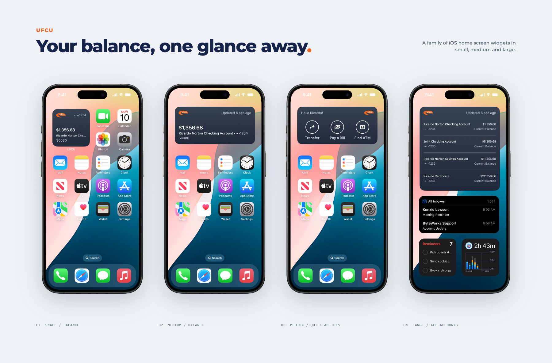
A family of home screen widgets in small, medium and large — balances, quick actions and a full account summary, each sized to the space it gets.
Overview
IHC Suspension makes suspension components for classic and custom trucks. Their packaging needed artwork that looked like it belonged to the vehicles their customers actually own.
The project produced original vehicle illustrations and applied them across the packaging line.
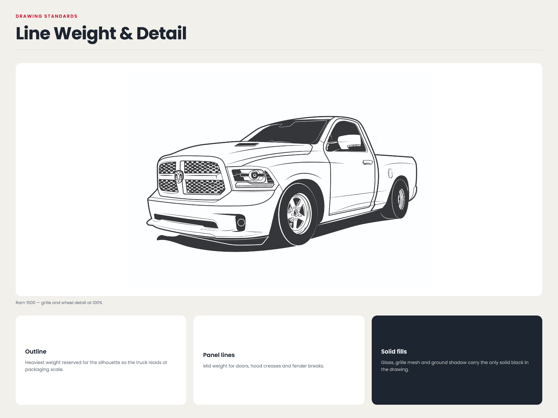
Custom Illustration
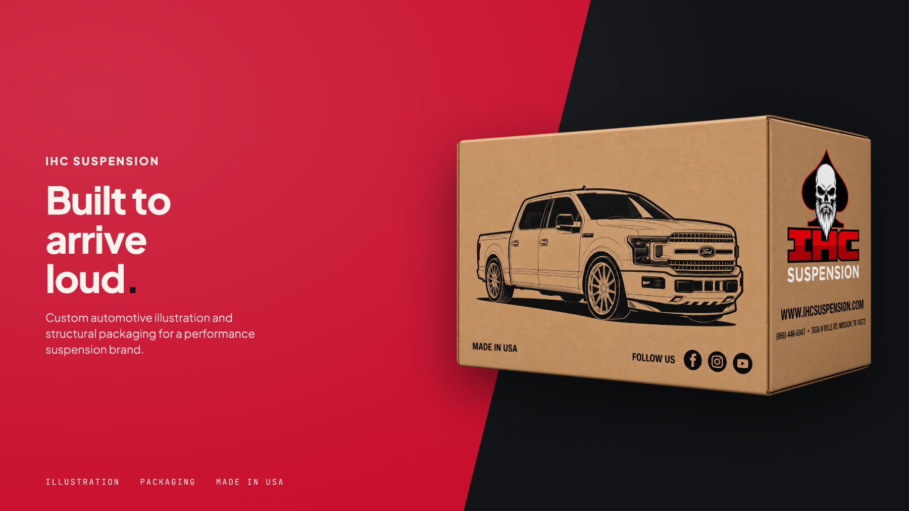
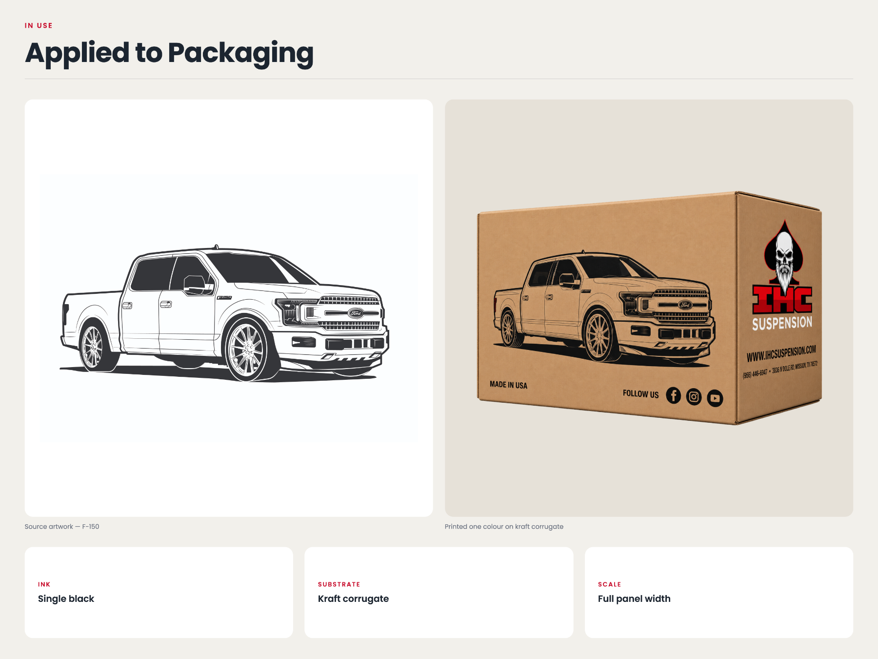
Each illustration was drawn to hold detail at box scale and stay readable in a single ink color.
Packaging
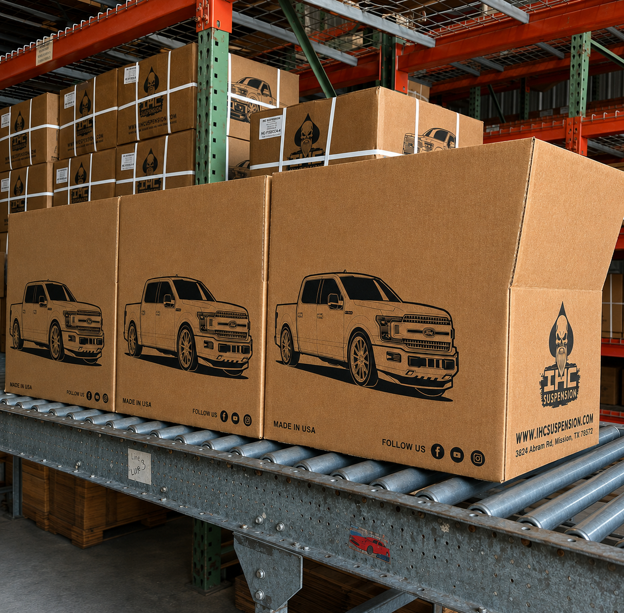
The illustrations anchor the front panel, with product information set around them so the range stays consistent from box to box.
The illustrations were prepared for print and manufactured, moving from drawing to a physical product on the shelf.
Overview
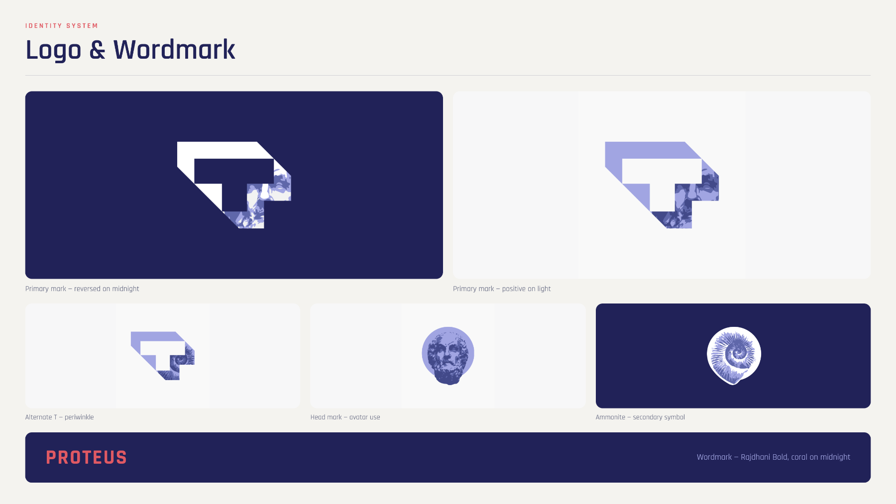
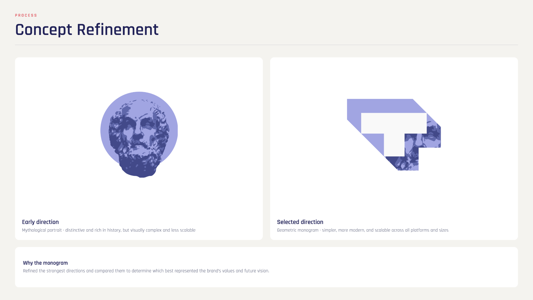
Transmute works in emerging technology. Proteus began as an internal exploration and grew into a full visual direction — mark, color, interface and supporting graphics.
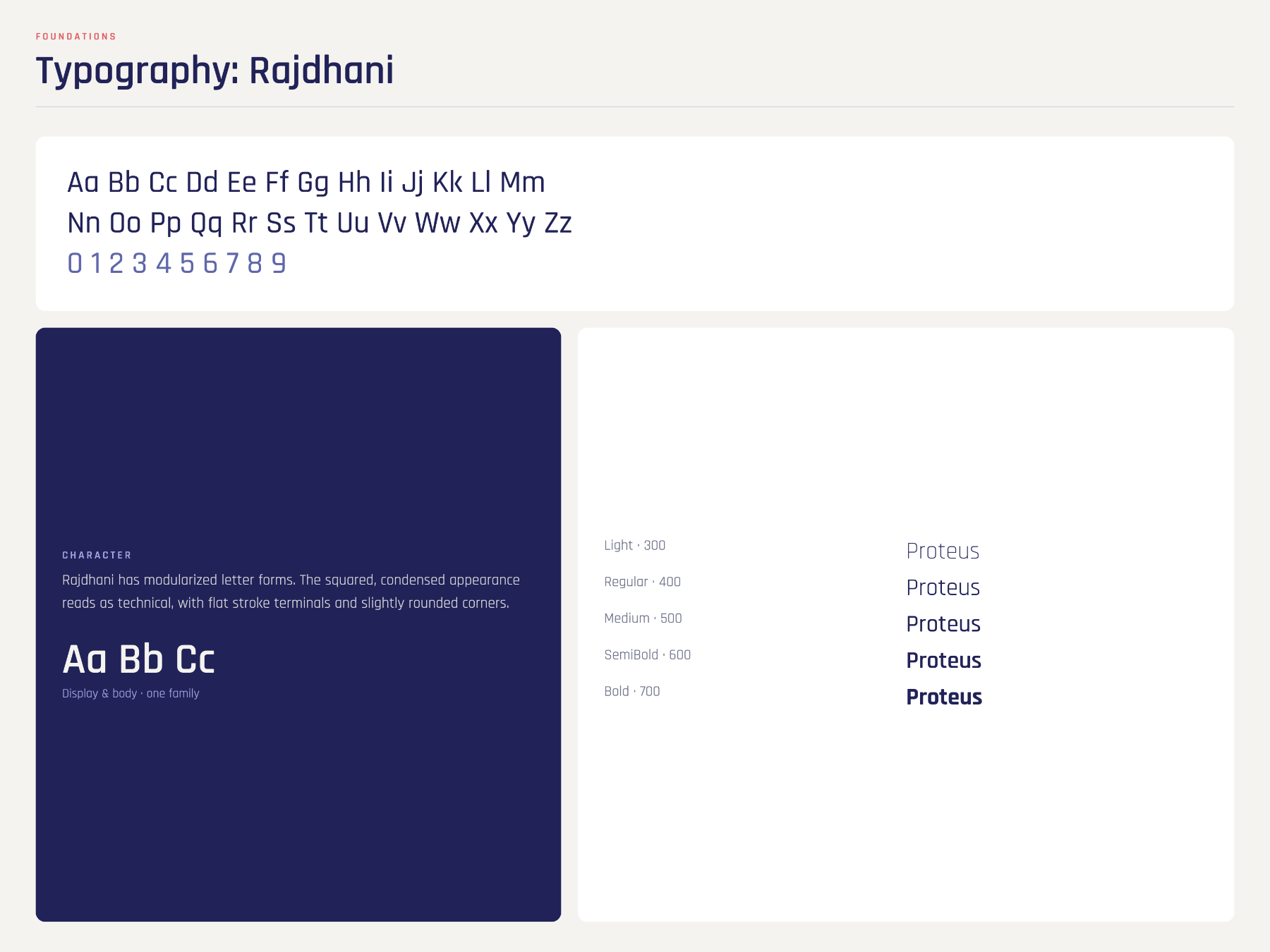
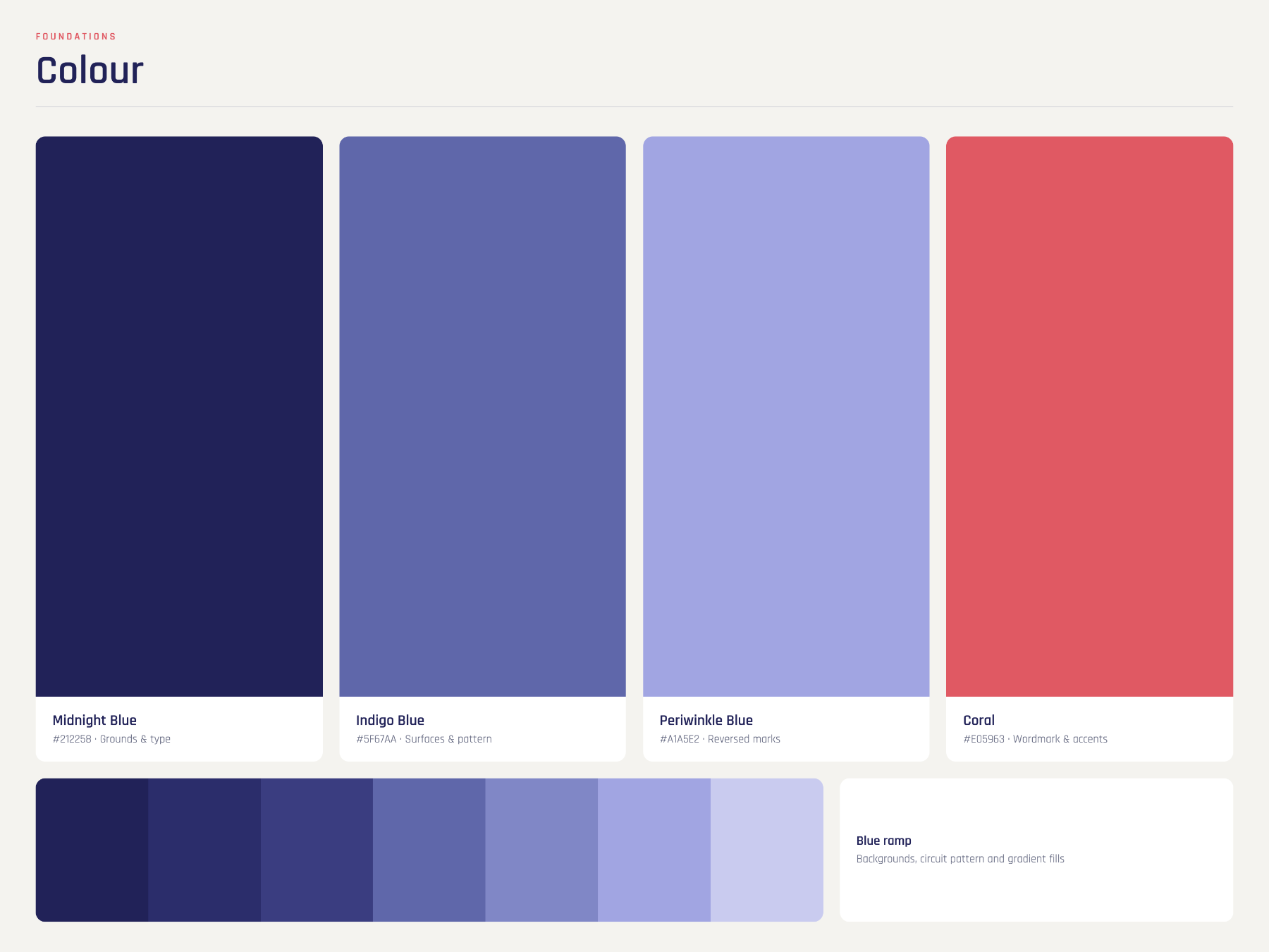
The brief allowed more range than a client identity usually does, so the system leans on a distinctive palette and confident geometry.
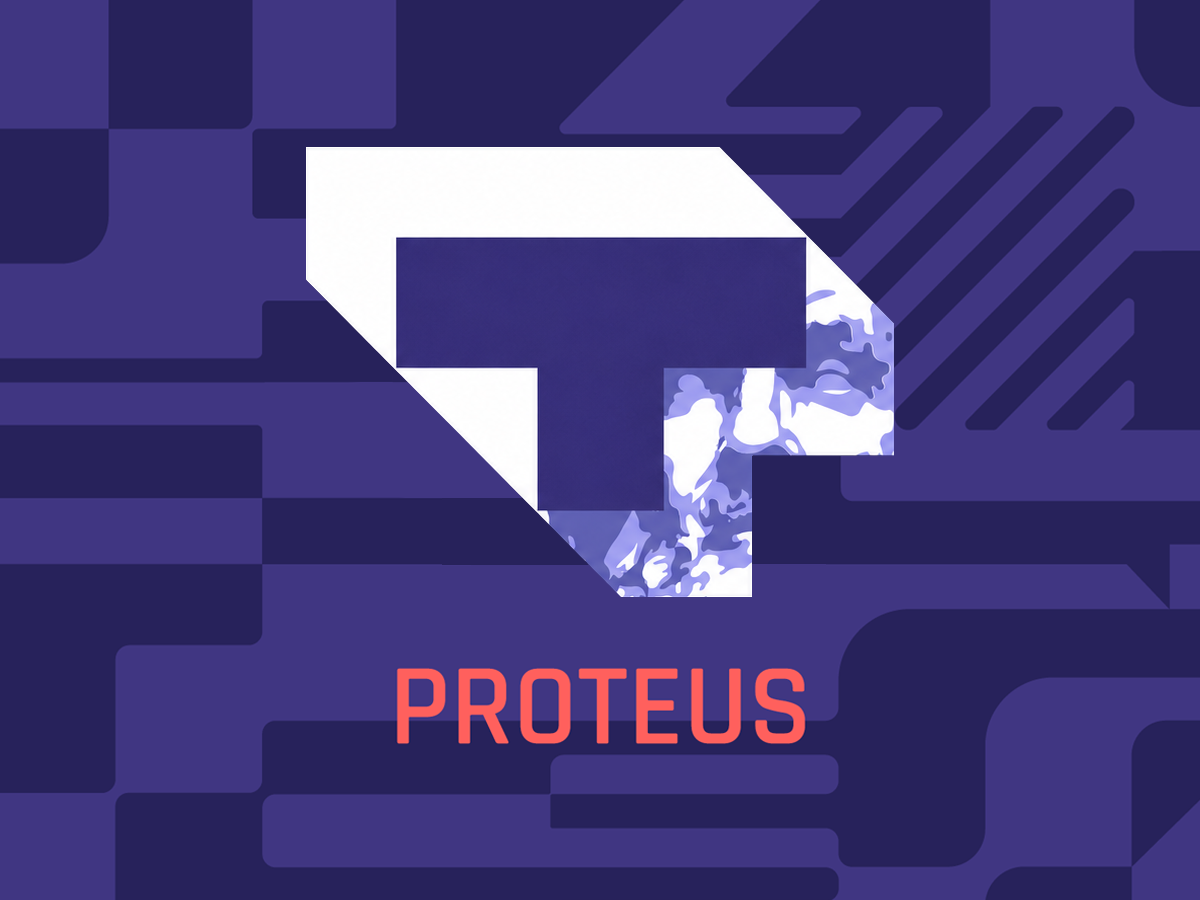
Proteus
Proteus takes its name from change, and the mark was drawn to hold up in motion, at small sizes and across dark and light surfaces.
Visual Direction
The palette pairs a deep purple ground with a warm coral accent, reserved for the moments that matter most.
Graphic Design
Additional assets extend the language into presentation, social and event material.
Outcome
{{ line }}
Next project
Have a project in mind?
Tell me what you're working on and let's see what we can make together.